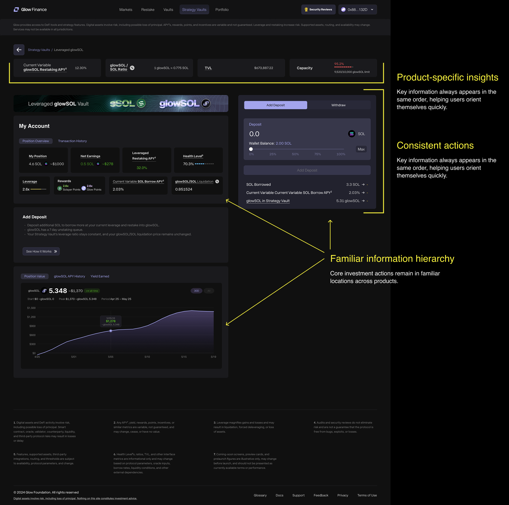
Designing a Shared Interaction Model for Yield Products
1. Context
As Glow expanded beyond individual investment products, the Yield ecosystem introduced Vaults, Strategy Vaults, leveraged products and new investment opportunities. Although these products served different purposes, they shared many underlying interactions while exposing different levels of complexity.
Designing each experience independently would have increased inconsistency across the platform and forced users to learn new interaction patterns every time a product was introduced.
The goal was to create a reusable interaction model that could scale with the ecosystem while preserving the specific information each investment strategy required.
2. Understanding the Problem
Research included competitor analysis, moderated usability testing and stakeholder feedback to understand how users navigated increasingly complex Yield products.Three consistent themes emerged across the research.
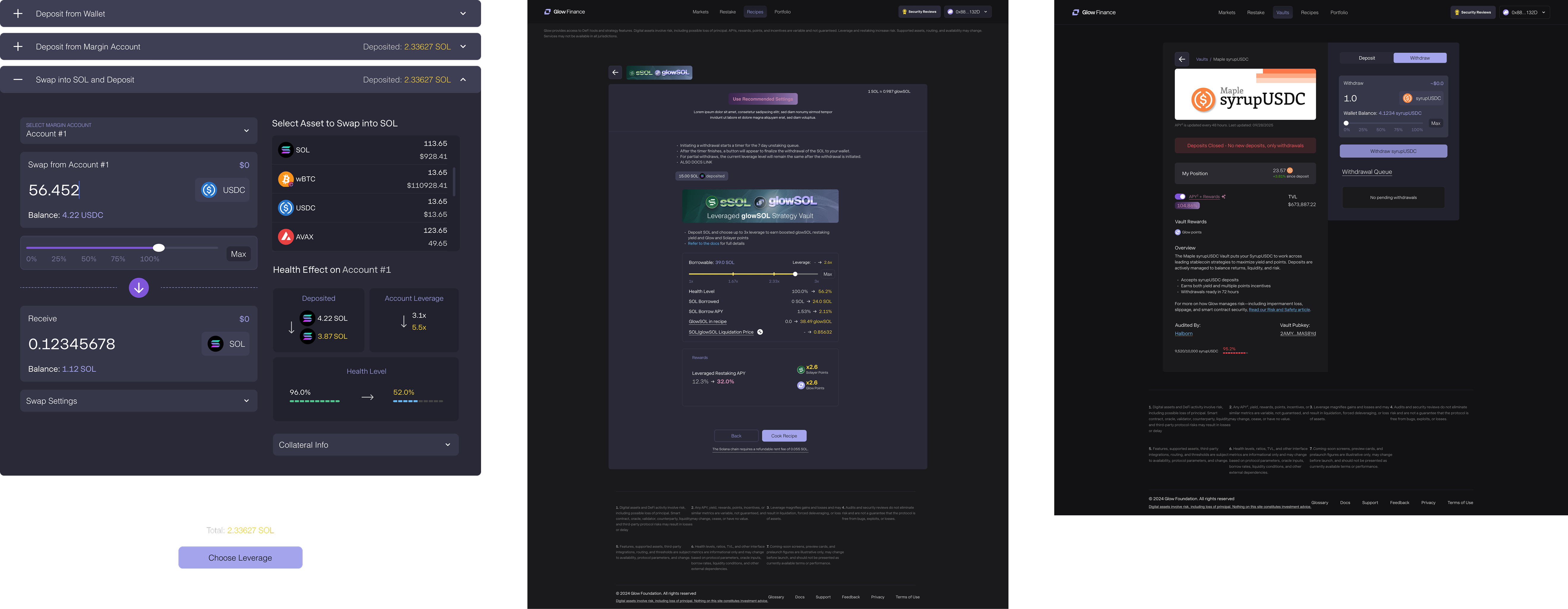
Users built mental models around products, not protocols
Participants expected similar investment products to follow similar interaction patterns. When layouts or terminology changed between products, users had to relearn the experience instead of relying on previous knowledge.
Financial decisions require confidence
Before committing funds, participants consistently looked for projected outcomes, balances, APYs and risk indicators. Missing or poorly prioritized information reduced confidence in the transaction.
Complexity should be progressive
Users appreciated advanced functionality but expected it to appear only when it became relevant to their current task rather than all at once.
3. Creating a Shared Layout
Rather than designing every Yield product independently, I established a shared page structure that could scale across Vaults and Strategy Vaults while allowing each product to expose its own information.
Principle 1
Consistent page hierarchy
Every product follows the same information order, helping users know where to find key metrics, performance data and investment actions regardless of the underlying strategy.
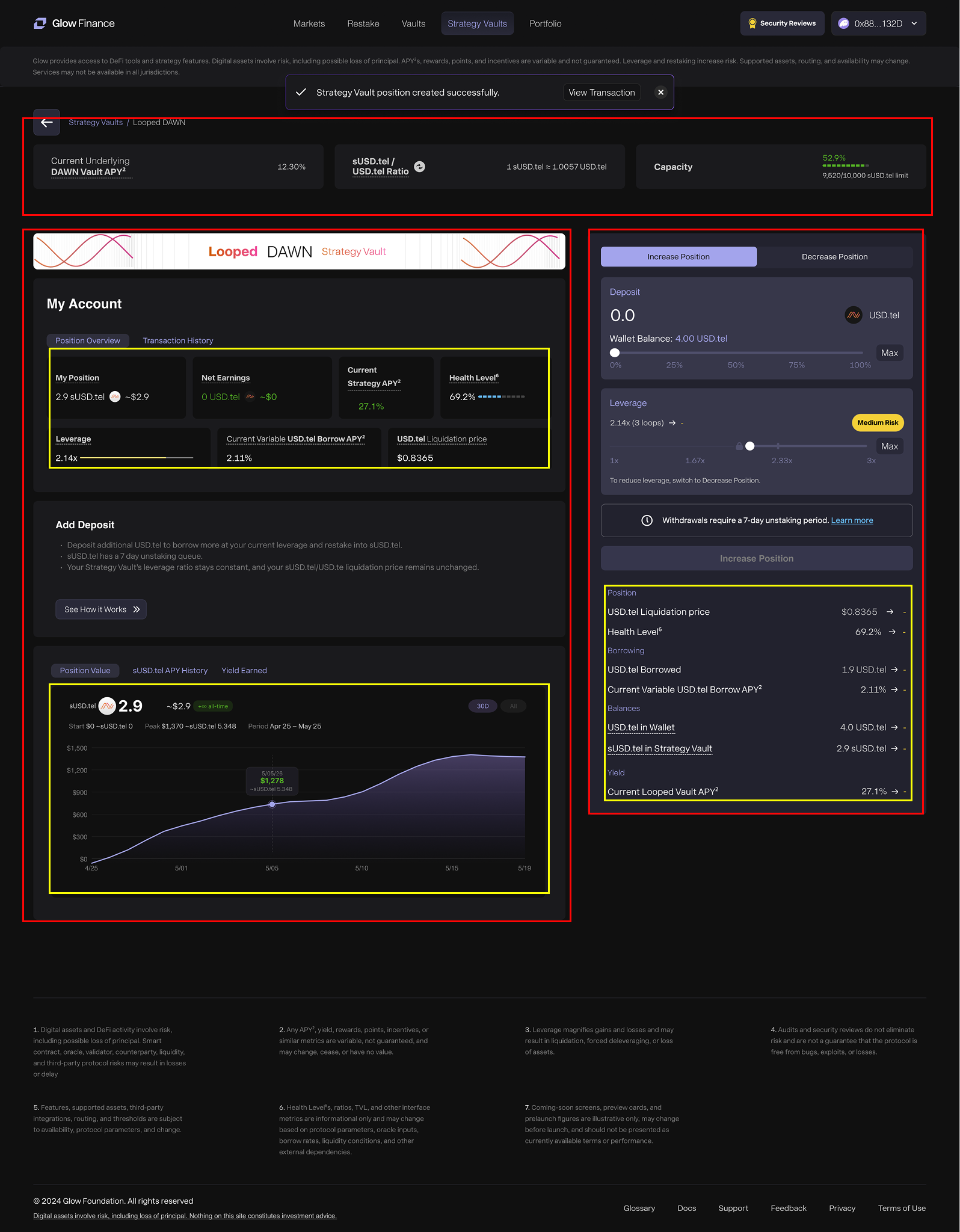
Principle 2
Shared layout, product-specific content
The overall page structure remains familiar while individual sections adapt to each investment strategy, exposing only the information relevant to that product.
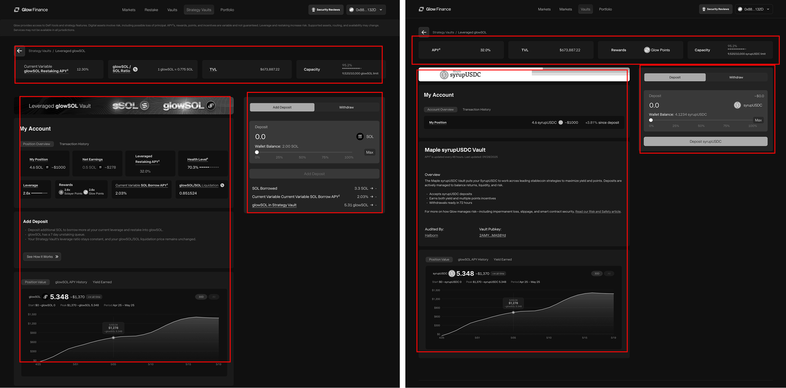
Principle 3
Designed to scale
As new Yield products were introduced, the shared layout reduced design duplication and provided a consistent foundation for future experiences instead of starting each page from scratch.
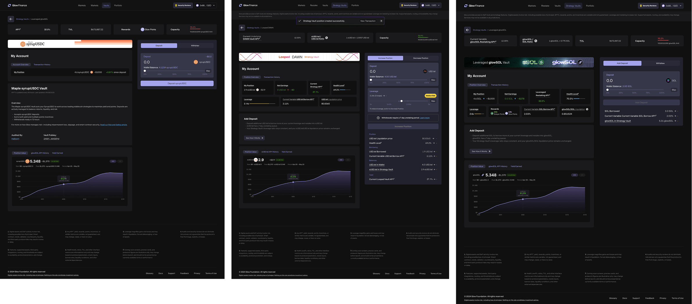
4. Applying the Shared Layout System
The shared layout system became the foundation for multiple Yield products. Rather than redesigning each experience from scratch, every new product reused the same page structure while adapting its content to different investment strategies and user needs.
5. Why This Approach Worked
Rather than creating independent interfaces for every new Yield product, the shared layout system established a consistent foundation that balanced familiarity with product flexibility.
As the ecosystem expanded, new products could reuse proven interaction patterns while exposing only the information unique to their investment strategy. This reduced design duplication, simplified collaboration with engineering and created a more predictable experience for users navigating multiple Yield products.
Reusable structure
A shared page hierarchy reduced the need to redesign common interactions for every product.
Familiar interactions
Users could move between Yield products without learning new navigation or workflows.
Flexible content
Each product remained free to communicate its own strategy, metrics and risks while preserving a consistent experience.
Built to scale
The system provided a foundation that future Yield products could build upon instead of starting from scratch.