Creating a Yields Hub

1. Context - A Growing Ecosystem Needed a Clear Entry Point

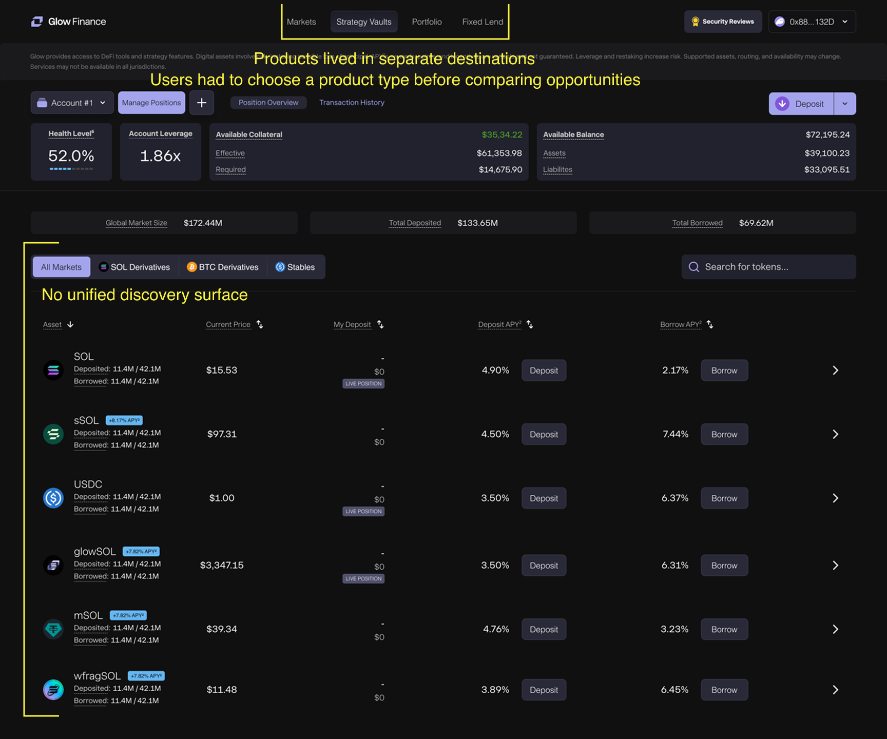
As Glow expanded beyond Markets, new Yield products were introduced across Vaults, Strategy Vaults and leveraged strategies.

The products themselves were becoming more sophisticated, but discovery was becoming fragmented. Users could access individual experiences through navigation, yet there was no single place to understand what opportunities existed, compare them, or decide where to go next.

The PM and I saw the need for a dedicated Yields Hub: a central discovery layer that could bring the growing ecosystem together without flattening the differences between each product.

2. Learning From Existing Yield Discovery Patterns

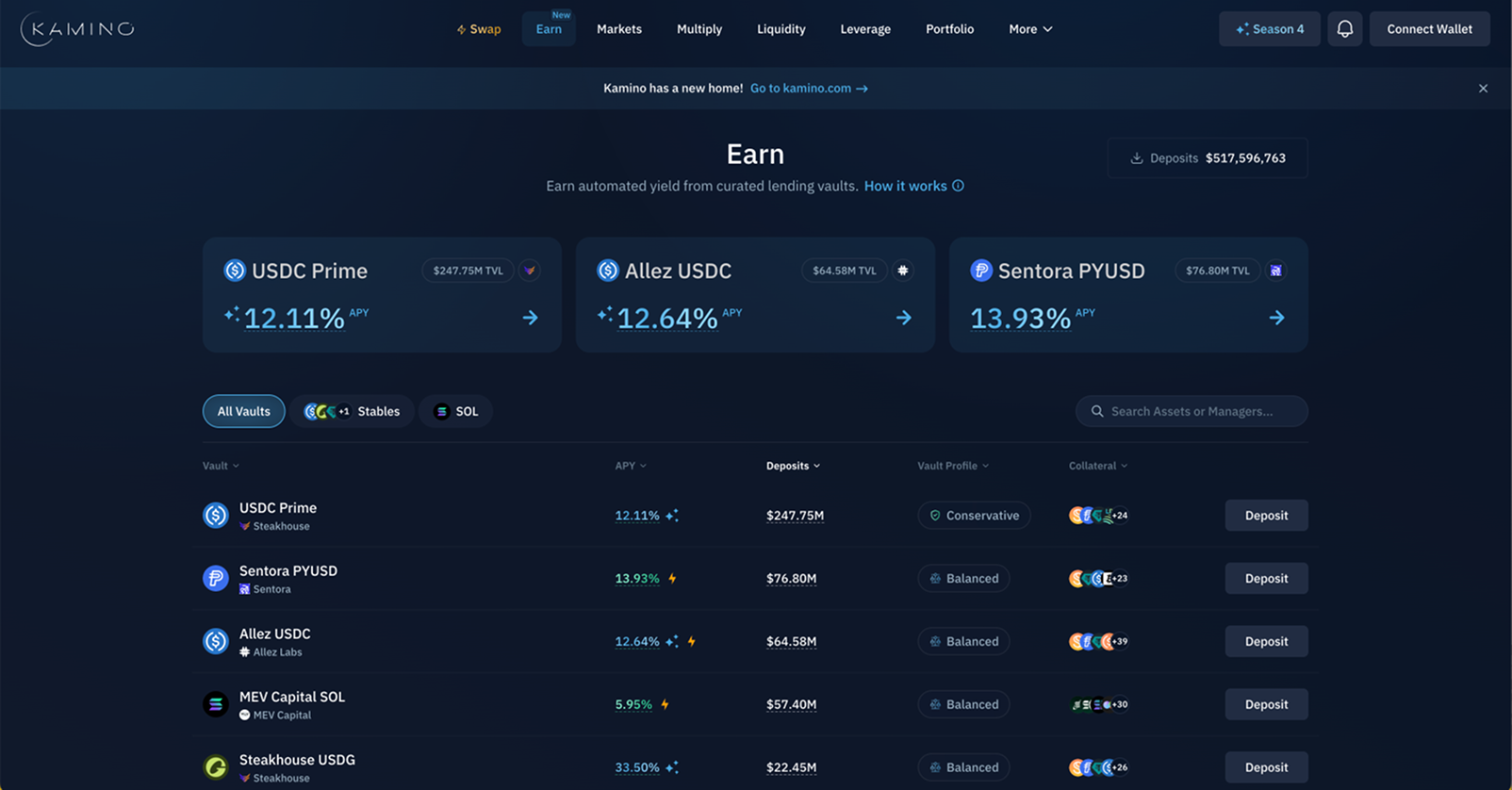
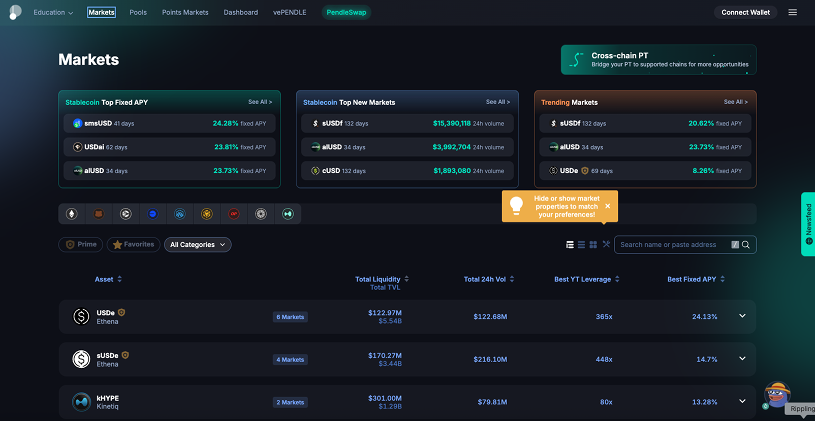
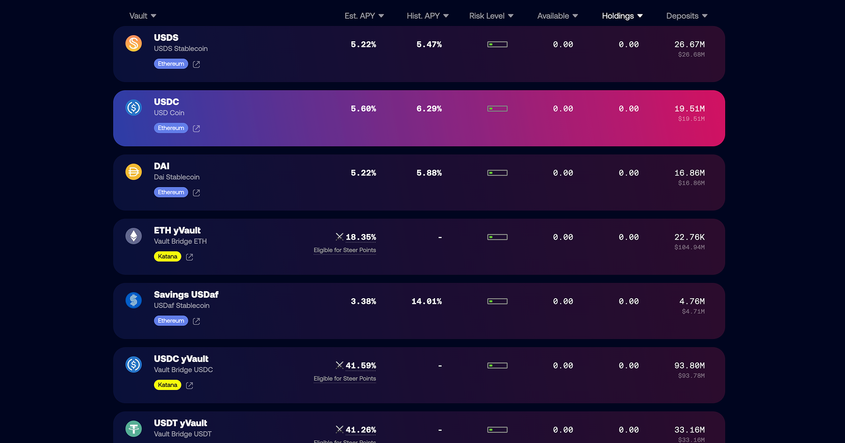
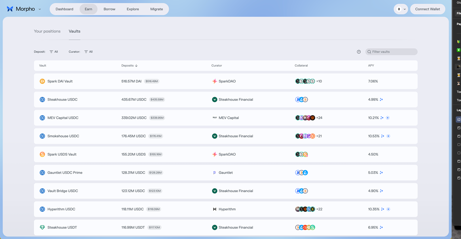
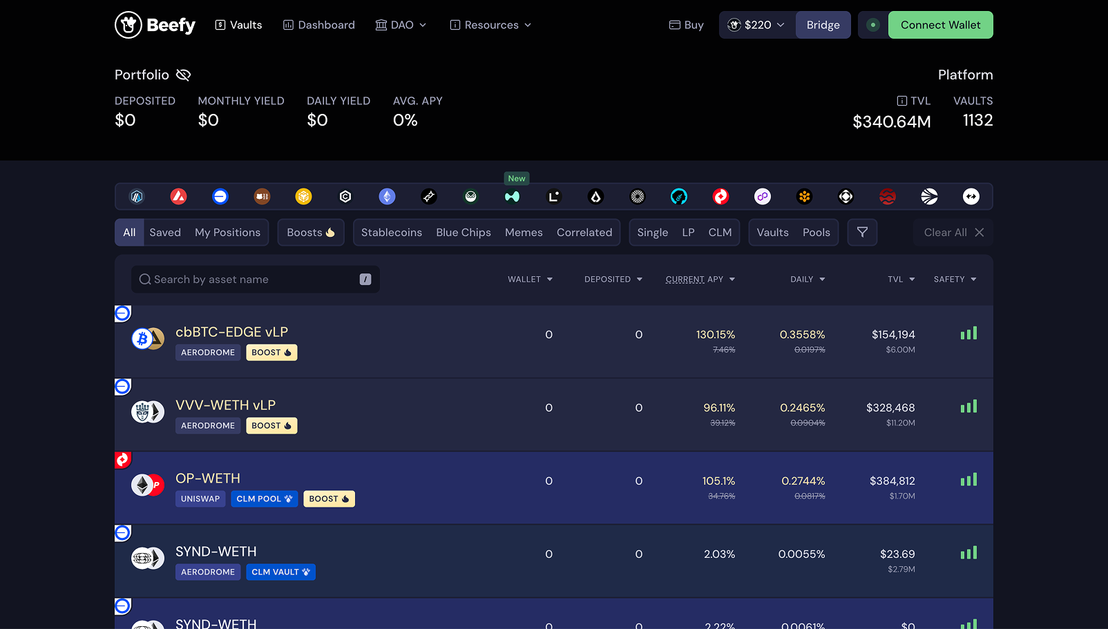
Before exploring UI directions, I reviewed how established DeFi products helped users discover and compare Yield opportunities.I focused on how competitors structured large product catalogs, surfaced key metrics such as APY and TVL, highlighted featured opportunities and managed the trade-off between discoverability and scalability.

Patterns reviewed across leading DeFi Yield products

Finding 01

Lists scale, but can become overwhelming
‍
‍‍
Row-based layouts made large catalogs easy to scan and compare, but products with many opportunities often relied heavily on filters and categories to keep discovery manageable.

Finding 02

Featured opportunities improve discovery
‍

Products that highlighted selected opportunities like Pendle created a clearer starting point than a flat catalog, especially when users were not arriving with a specific strategy in mind.

Finding 03

Comparison and exploration need to coexist
‍

The strongest pattern was a hybrid approach: highlight a small number of opportunities while keeping a structured list underneath for deeper comparison and scalability.
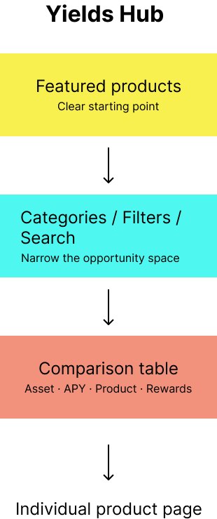
Design direction: combine a clear entry point with a scalable comparison layer rather than choosing between a promotional landing page and a dense product catalog.

3. Defining the Information Architecture

The competitive review gave me a clear direction: the Yields Hub needed to work both as an entry point for discovery and as a scalable comparison surface.

I translated those patterns into an information architecture that combined featured opportunities, product categories and a structured comparison table. I reviewed the direction with the PM and frontend engineering to make sure it could support the different Yield products we already had — and the ones we expected to add later.
‍

Product & Engineering Alignment - I worked closely with the PM and frontend engineering to pressure-test the structure before prototyping, balancing discoverability, product requirements and implementation constraints.

With the architecture agreed, I built an interactive prototype to test whether users actually understood the hub, could compare opportunities and could move naturally into the different Yield products.

A clear starting point

Featured opportunities helped users begin exploring without confronting the full product catalog at once.

Scalable exploration

‍Categories, filters and search allowed the same page to remain useful as more assets and Yield products were introduced.

Comparison before commitment

A shared table surfaced the most relevant decision signals before users entered a specific Vault, Strategy Vault or Lending Pool.
4. Validating the Prototype

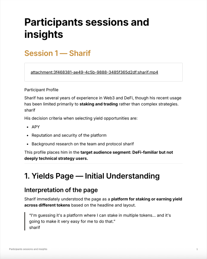
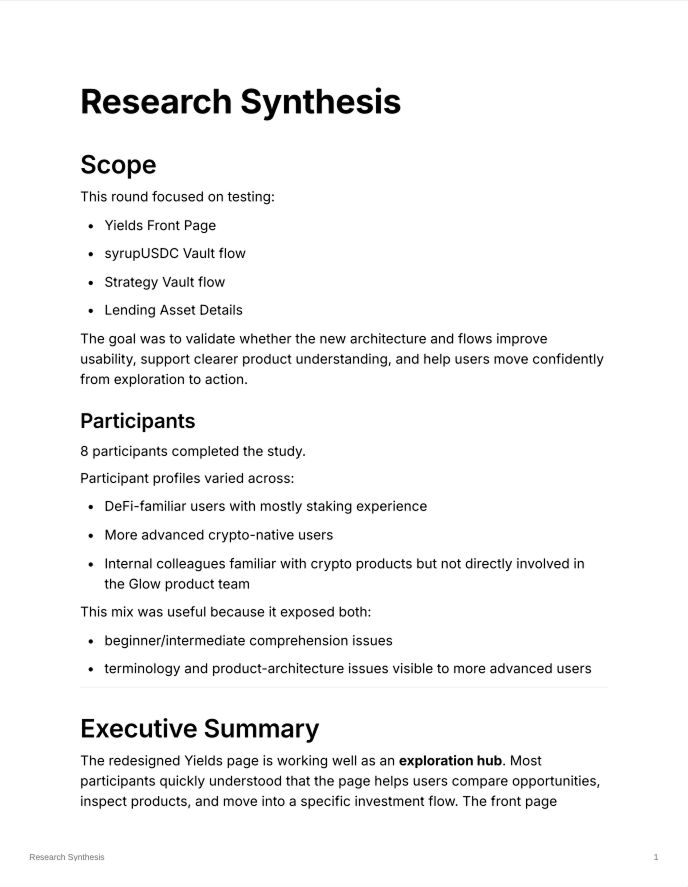
Once the direction was aligned with Product and Engineering, I built an interactive prototype and ran moderated usability sessions to validate whether the Yields Hub actually worked as a discovery layer.The study included 8 participants with different levels of DeFi experience. I asked them to interpret the page without guidance, find a suitable Yield opportunity, compare options and move from the hub into specific products.
‍

8 participants
45–60 min moderated sessions
Prototype testing
Discovery → Comparison → Product selection

01. The hub concept was validated

Most participants immediately understood the Yields page as a place to explore and compare investment opportunities. The core idea of creating a central discovery layer worked.

02. Exploration worked, but product taxonomy did not

Users could navigate from the hub into individual opportunities, but the distinction between Vaults, Strategy Vaults and Lending Pools was not immediately clear.This showed that the discovery model itself was working, while the product taxonomy still required refinement.

03. Rewards created uncertainty during comparison

Glow Points were highly visible, but users did not understand their value or how they affected APY. Several participants chose to ignore them and evaluate opportunities using base yield instead.This revealed that a metric intended to support comparison was actually introducing uncertainty into the decision process.

The core hypothesis was validated: users understood the Yields page as a useful exploration and comparison hub, and were generally able to move from discovery into a chosen product.The remaining issues were concentrated around product terminology, reward clarity and information hierarchy, rather than the purpose of the hub itself.

5. Final Experience

The usability test validated the Yields Hub as the right discovery model, so the final iteration focused on refinement rather than changing the core concept.I tightened the information hierarchy, kept comparison at the center of the experience and preserved a clear path from broad exploration into individual Yield products.
‍

Clear starting point

Featured opportunities create an immediate entry point without forcing users into the full catalog.

Comparison stays central

‍The main table keeps assets, APY and Yield sources visible together, supporting the comparison behavior observed during testing.

Exploration before commitment

Filters and product categories help users narrow the opportunity space before entering a specific Vault, Strategy Vault or Lending Pool.

The final Yields Hub gave Glow a dedicated discovery layer that could grow alongside the product ecosystem.Instead of requiring users to understand the platform structure first, it provided one place to explore opportunities, compare the signals that mattered and decide where to go deeper.