Glow Finance

Designing intuitive experiences for complex DeFi products.

My role
Product Designer

Duration
2 years

Responsibilities

Product Strategy · UX Design · UI Design · Design Systems · Prototyping · Product Analytics

The context

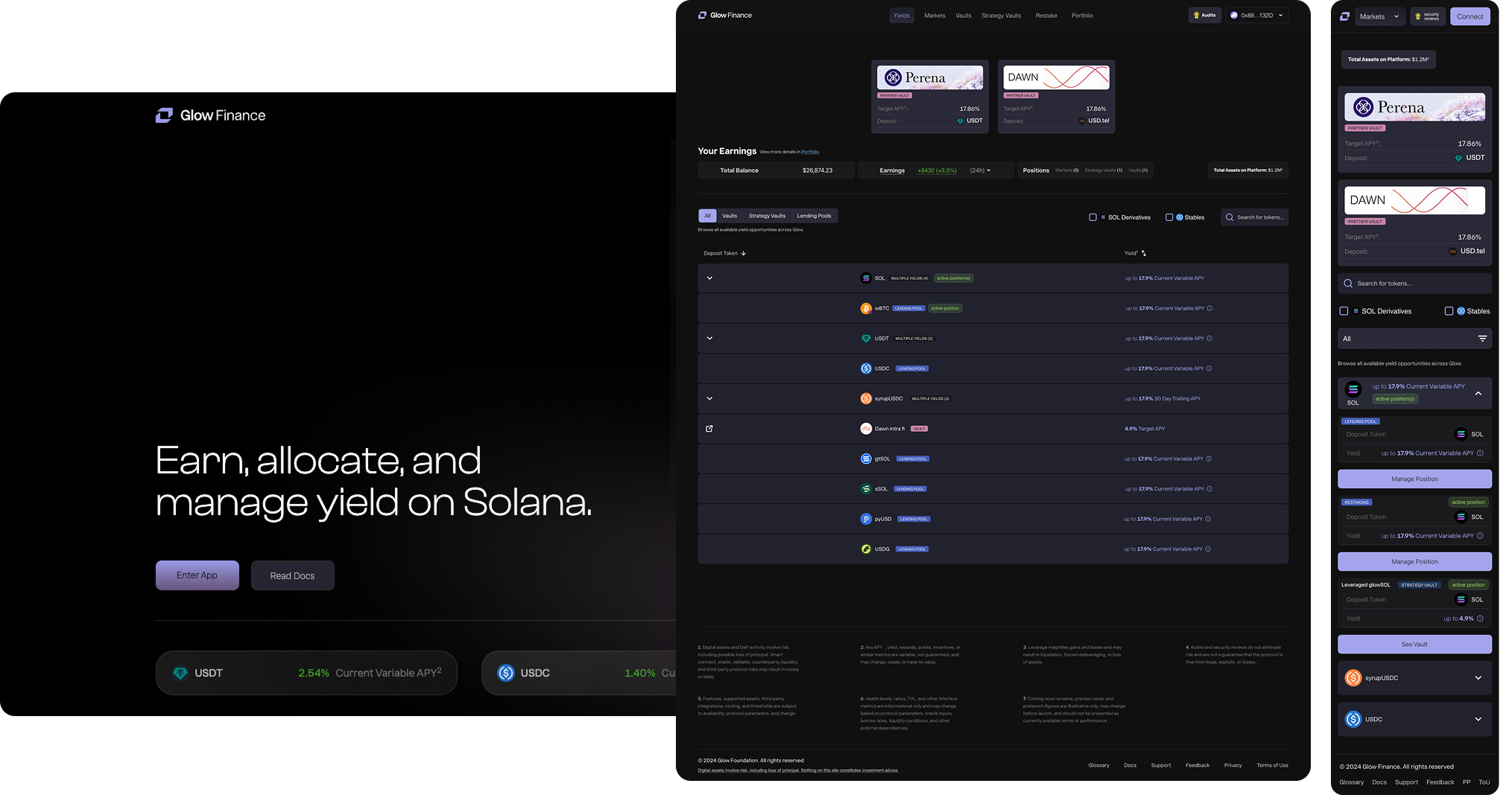
Glow Finance is a decentralized finance platform built on Solana, offering lending markets, yield products and leveraged strategies. As the ecosystem expanded, users were expected to navigate increasingly sophisticated financial products without sacrificing confidence or usability.My role was to help transform complex protocol mechanics into intuitive product experiences while maintaining consistency across a rapidly evolving platform.

The challenge

Designing for DeFi goes beyond arranging components on a screen. Every interaction affects user trust, financial decisions and protocol behavior. The challenge was to simplify complexity without reducing transparency.

• Explain sophisticated financial concepts without overwhelming users.
• Build confidence before users sign on-chain transactions.
• Create consistent experiences across multiple financial products.
• Balance business goals with protocol and engineering constraints.
• Design scalable patterns that could support future products.

Discovery

Rather than relying solely on assumptions, I combined competitive analysis, iterative design and continuous product feedback to better understand how users interacted with complex financial products.This process revealed recurring patterns that shaped the design principles used throughout Glow.

Research Approach

Competitive analysis

I analyzed leading DeFi platforms to understand common interaction patterns, transaction flows and information hierarchy. The objective wasn't to copy existing solutions, but to identify conventions users were already familiar with and opportunities where Glow could differentiate.

Product Feedback

Throughout development, design decisions were continuously challenged through product discussions, internal reviews and iterative testing. Recurring questions and usability issues helped identify where users needed greater clarity and confidence.

Measurement Strategy

Every major flow was designed with measurement in mind. By defining key events, conversion funnels and friction points early, the team could validate future design decisions using real product behavior.

Research Insights

Product architecture created confusion

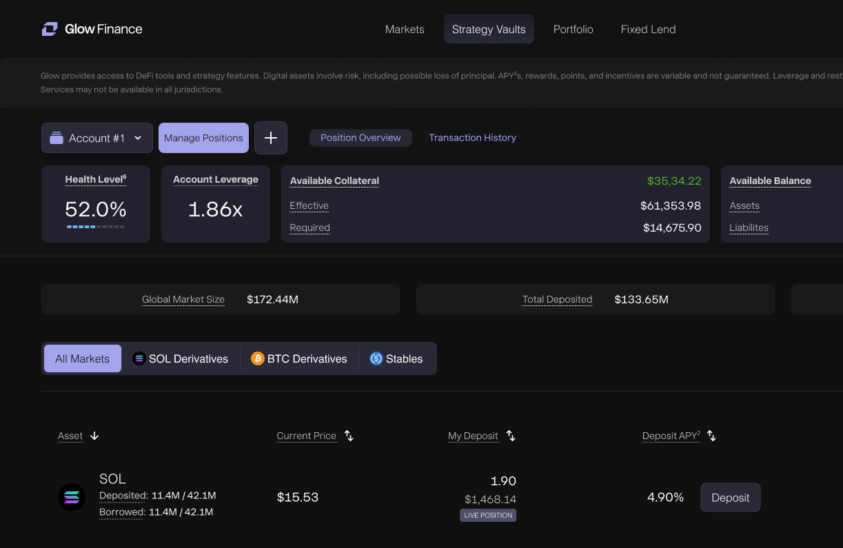
Many users struggled to distinguish between lending markets, vaults and strategy vaults. Similar terminology often hid fundamentally different financial products.

Users needed reassurance before committing funds

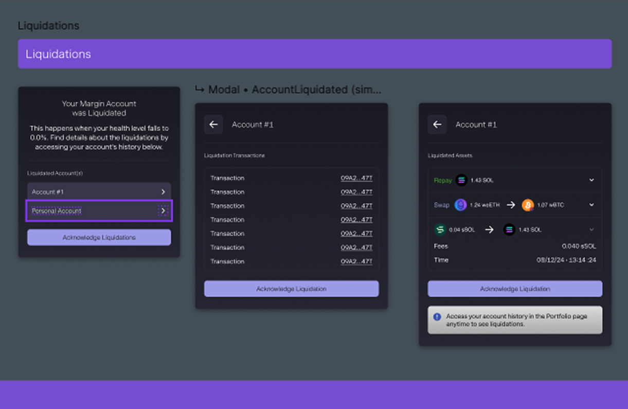
Users wanted to understand the outcome of a transaction before signing it. Important information was available, but not always presented in the order they needed it.

Important information competed for attention

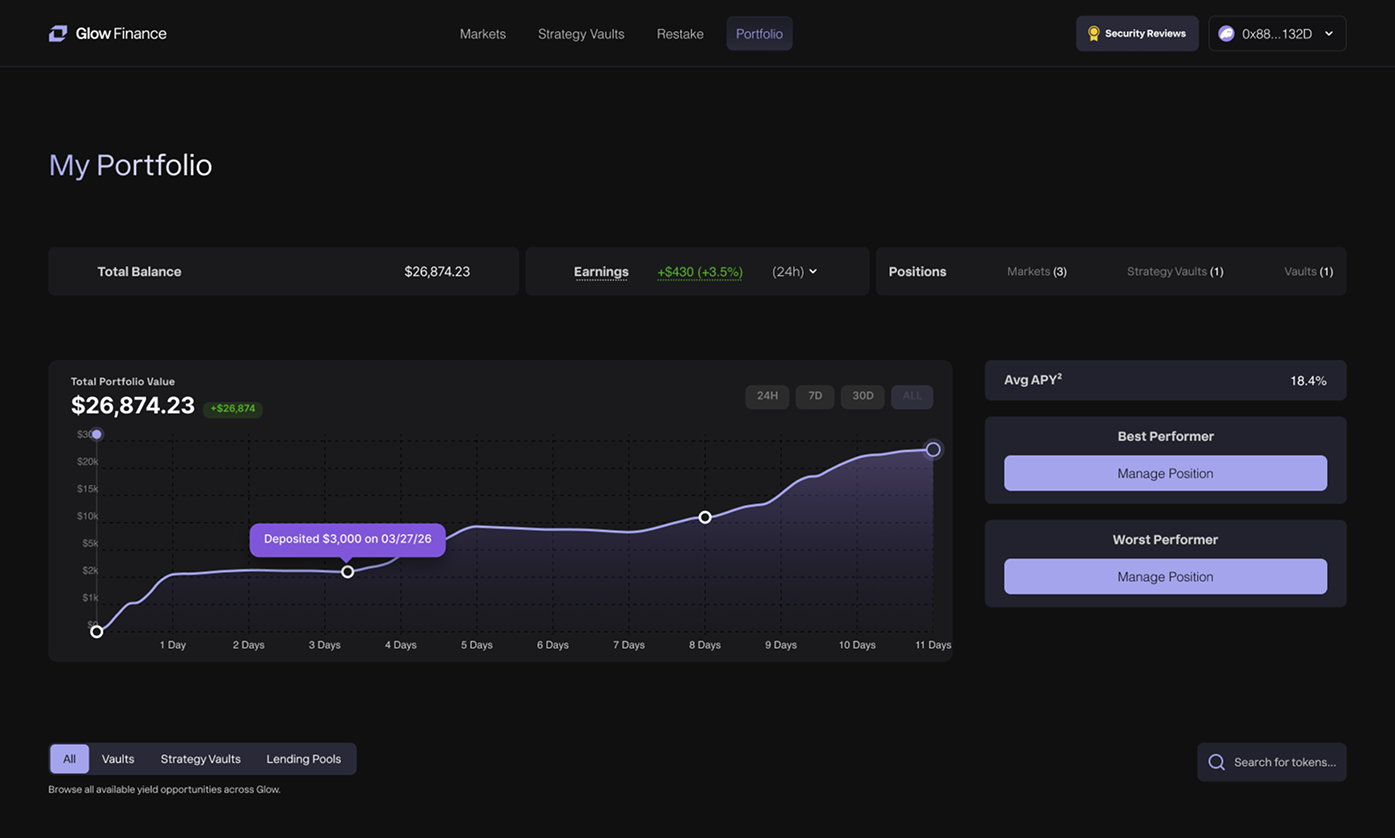
Balances, APYs, health metrics and rewards often competed for attention, making it difficult to identify what mattered most during a decision.

Consistency reduced the learning curve

As new products were introduced, maintaining familiar interaction patterns became essential to reduce the learning curve across the platform.

Design Approach

1. Understand the protocol

Before exploring solutions, I worked closely with product managers and engineers to understand how each protocol behaved, which constraints existed and where design could simplify the user experience.

2. Map user journeys

I translated technical protocol behavior into end-to-end user journeys, identifying moments where users needed more clarity, reassurance or feedback before taking action.

4. Validate with engineering

Design decisions were continuously refined alongside engineering to ensure proposed solutions remained technically feasible without compromising usability.

5. Measure behavior

I established an analytics strategy that defined how user behavior would be measured after launch, ensuring future iterations could be guided by product insights instead of assumptions.

Designing the Experience

Research identified recurring usability patterns, but solving them required more than redesigning individual screens. As Glow expanded, every new financial product introduced new requirements while users still expected a familiar experience.Instead of designing isolated interfaces, I focused on creating reusable interaction patterns that could evolve alongside the platform while reducing cognitive load and maintaining consistency.

A scalable transaction experience

The transaction panel was the core interaction across Glow's ecosystem. Whether users were depositing assets, opening leveraged positions or interacting with yield products, this was where every financial decision was made.Over two years, the transaction experience evolved from a single product-specific interface into a scalable framework capable of supporting multiple products without forcing users to learn a new interaction every time.

Initial implementation

The first transaction experience was designed for a single leveraged product. By keeping every action inside a guided modal, users could configure their position, review projected outcomes and execute the transaction within a focused workflow.At this stage, the product addressed a single use case, making a guided modal the most effective solution for balancing flexibility and clarity.

Growing with the product

As Glow introduced additional functionality, the transaction panel gradually absorbed new responsibilities. Swaps, leverage, collateral management, health metrics, rewards and advanced configuration all became part of the same interface.While this approach accelerated development and preserved familiarity, it also increased cognitive load by presenting every capability regardless of whether it was relevant to the current task.

A scalable transaction framework

As Glow introduced additional functionality, the transaction panel gradually absorbed new responsibilities. Swaps, leverage, collateral management, health metrics, rewards and advanced configuration all became part of the same interface.While this approach accelerated development and preserved familiarity, it also increased cognitive load by presenting every capability regardless of whether it was relevant to the current task.

Design Principles

  • Progressive disclosure
    Advanced configuration remains available without competing with the primary task.
  • Familiar interaction patterns
    Users interact with a consistent workflow regardless of the product they are using.
  • Context-driven information
    Each transaction presents only the information required to make an informed financial decision.
  • Built to scale
    New products can adopt the same interaction framework without redesigning the entire transaction experience.

Outcome

The result was a transaction framework that scaled with the product instead of against it. As Glow introduced new financial experiences, each product could adopt familiar interaction patterns while exposing only the controls and information that mattered to its users.